


Arties Ice Cream
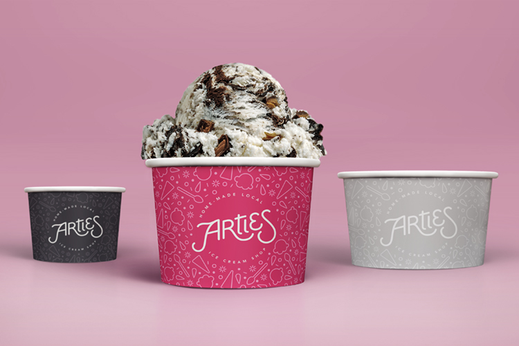
Brand IdentityThis branding concept revives a beloved neighborhood ice cream shop from my childhood. The logo features custom lettering with mono-weight lines and open curves that are reflected in the rest of the branding. It also includes a whimsical ice cream-themed pattern — appearing in different colors for different sizes of ice cream cups — whose individual elements can be reused elsewhere in the marketing and visual identity, as seen on the menu.